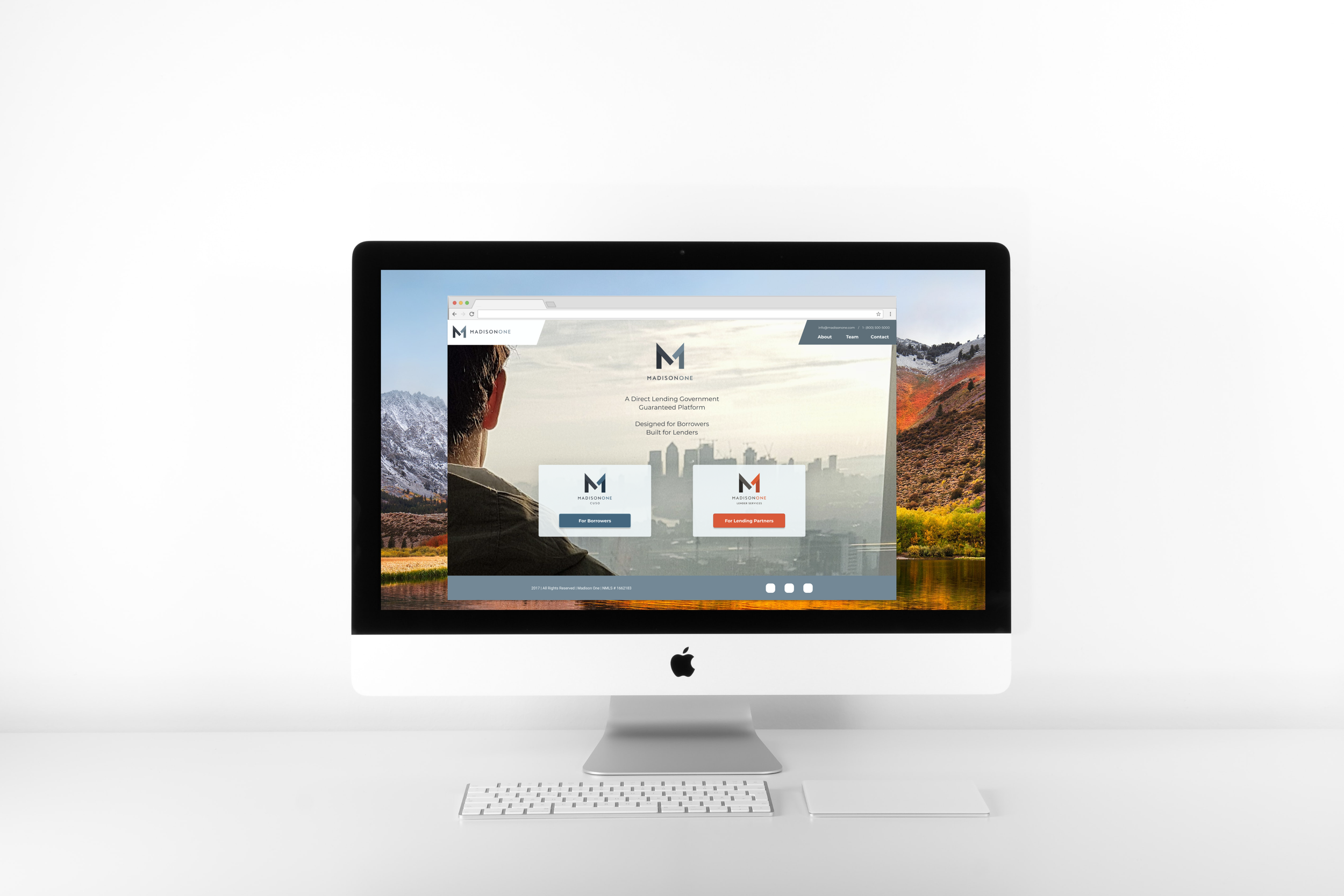
MADISON ONE
Designed the global navigation, design systems, and organized the information architecture for the entire site.
Duration: 5 Months
ROLE
As a Product designer, on a team of 3 designers, with a Product Manager overseeing
DESIGN METHODS
Design Studio, Content Strategy, Rapid Prototyping, Design Systems, Market Research, Responsive Design, and Client and Customer interviews
TOOLS
Figma, Adobe Photoshop, Slack, Google Drive
OVERVIEW (SUMMARY)
As a Product Designer, I worked with the Handsome Stranger Design Team (which included 3 other designers) on creating the Madison One entire website. The business goal was to seamlessly merge Madison One (Cuso) and Madison One (Lender Services) into one website that would still have two different goals(flows) per customer need. With continuous communication with the Handsome Stranger Product Manager, and founder, and working closely with the other 3 designers, we were able to meet this goal.
DESIGNERS TASK
Redesign two customer flows for Madison One, one being for customers that have or are seeking a loan (potentially new customers) and the other for lender services (credit unions and banks) nationwide.
END-USER
Customers are familiar with bank processes as well as government-guaranteed financing
Customers including but not limited to banks, lenders, and individuals seeking loans.
THE DIVE IN (PROCESS)
Our client, at the beginning of the project, knew who their user was and made their point-of-view very clear. Madison One wanted to have a cohesive website where both borrower and lending services would be held. This new site was to be built for both customers to navigate through, but each had a different need. As Designers, we did some business and competitive analysis first to become more proficient in borrower/lender terminology. We also wanted to get an understanding of similar companies and wanted to make sure that new users of this site would easily be able to understand it as well.
GOAL
Through this analysis and research, we found out that clear communication in the website would help each customer navigate. We kept thinking of the “KISS” Keep It Simple Stupid method. Which helped inform our design making the landing page less clickable and gave the end-user less confusion.
SOLUTION
Reorganization, text hierarchy, page content, breathing room, and keeping an overall consistency with all content was the main solution to redesign project.


