YONDER
Designed the foundation for the design systems, the global navigation, and ensured all pages were pixel-perfect through responsive design. We ended the design project with results increasing landing page conversion rates by 25%.
Duration: 4 Months
ROLE
As a Product designer, on a team of 4 designers, with a Product Manager overseeing
DESIGN METHODS
Market Research, Design Studio, Content Strategy, Rapid Prototyping, Responsive Design
TOOLS
Figma, Adobe Photoshop, Slack, Google Drive

OVERVIEW (SUMMARY)
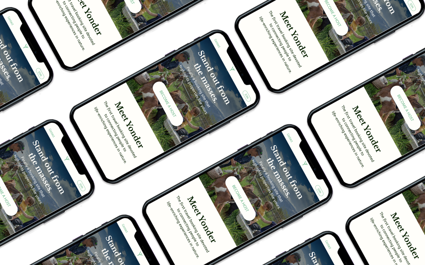
As a Product Designer on contract, I worked with the Handsome Stranger Product Manager and 4 other designers on creating the new home page for the client, Yonder (a travel booking company devoted to connecting people to life-enriching experiences out in nature). Our goal was to help the Yonder stakeholders express their vision for the company’s first website. Through continuous communication with the Handsome Stranger Design Team, I was able to design the foundation for the design systems, the global navigation, and ensured all pages were pixel-perfect through responsive design.
DESIGNERS TASK
Design the Yonder website Home Page with the user in mind and prioritizing the business goals. The business goals were to get users to either sign up as a “host” (property owners, who what to share their property) or “guest” (vacation at a property with their family).
END-USER
Adult ages 25-45
Who love all things outdoors and wish to vacation in rural areas with their friends and family
They are in a wide range of technically savvy humans to beginners
That understand the basic digital platform norms.
At the beginning of the project, the Product Manager explained the brief and the company’s background of Yonder. The brief said that Yonder was a new company and their number one goal was to start to get clients on both the host and guest sides. I did some market research on company’s similar that had the host/guest framework and found some good groundwork to start from.
VISUALLY CREATING YONDER(PROCESS)
SOLUTION
Create a home page the is clear and to give the potential customer exactly the interaction that they wanted but we also needed it to meet the business goals. We opted to be very clear with verbiage, made a consistent navigatable layout, made sure our hierarchy was clear for all users and made the entire website responsive. We also made sure the information we had was relevant and intentional.
PROBLEMS THAT AROSE
As designers, we started designing early on and did a lot of pair design. This wasn’t so much a problem per se as it was a mind meld of people working all at once. Towards the middle and end of this we each decided to take a step back and figured out the best way to be efficient with each person’s time. We quickly took on separate tasks and it ended up working. Since we all designed together we were able to pick up where someone else left off.